The following post is sponsored by Minted
 Our new apartment has been a complete godsend. Having more space has completely changed our dynamics and overall just made us a lot happier, and we’re enjoying having a clean slate to decorate and redesign. A question Andrew and I get a lot is about how we compromise on decor decisions or if I decorate everything on my own. The answer is no, I don’t just go out and buy whatever I want, but I do have a lot of free reign because Andrew seems to trust most of my decisions (I think/hope). However, he does like to have an opinion about things, and when it comes to big decisions like furniture, artwork or overall colors and patterns, he likes to be involved and I like to make sure he’s happy with the decision.
Does that mean we agree on everything? NO WAY.
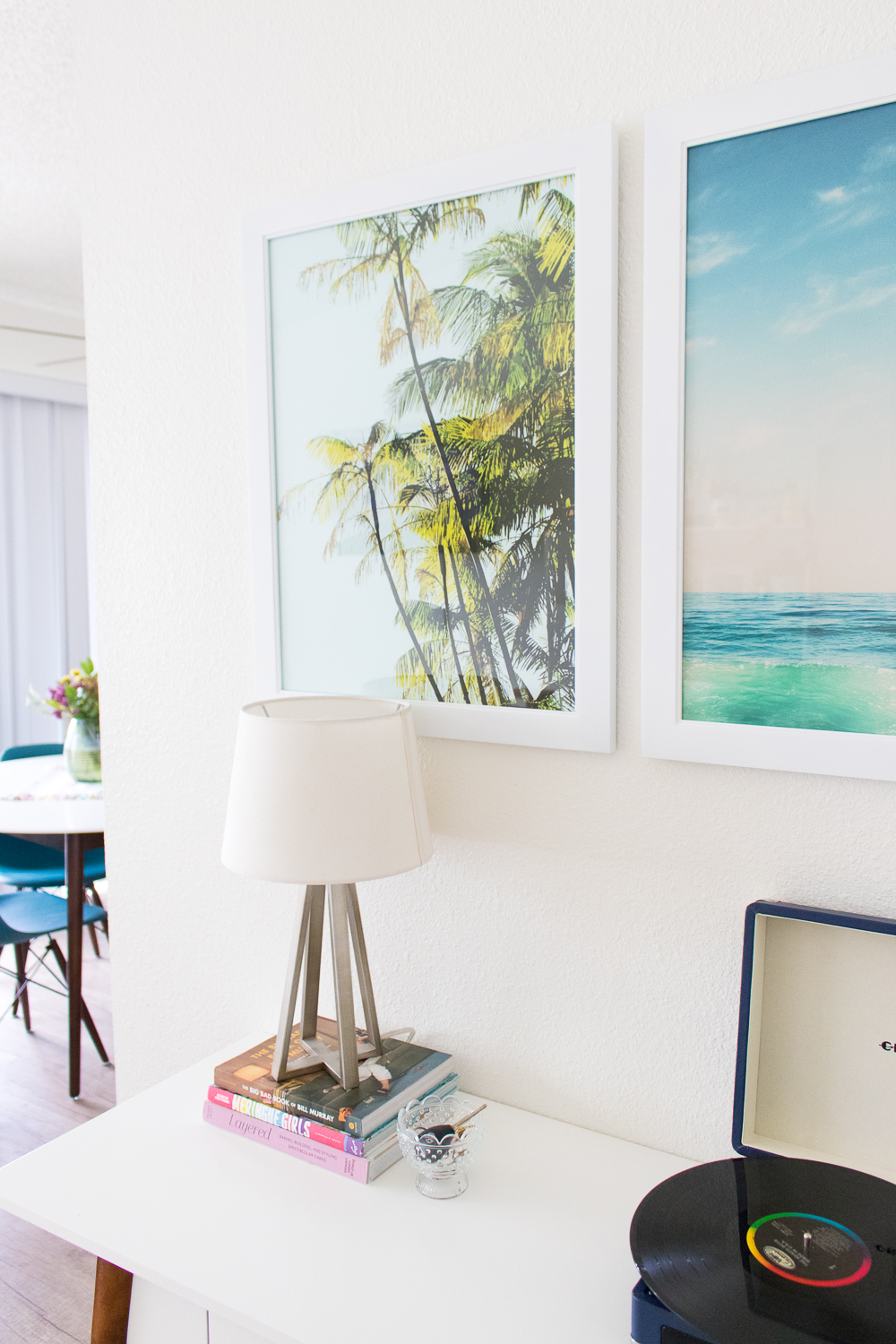
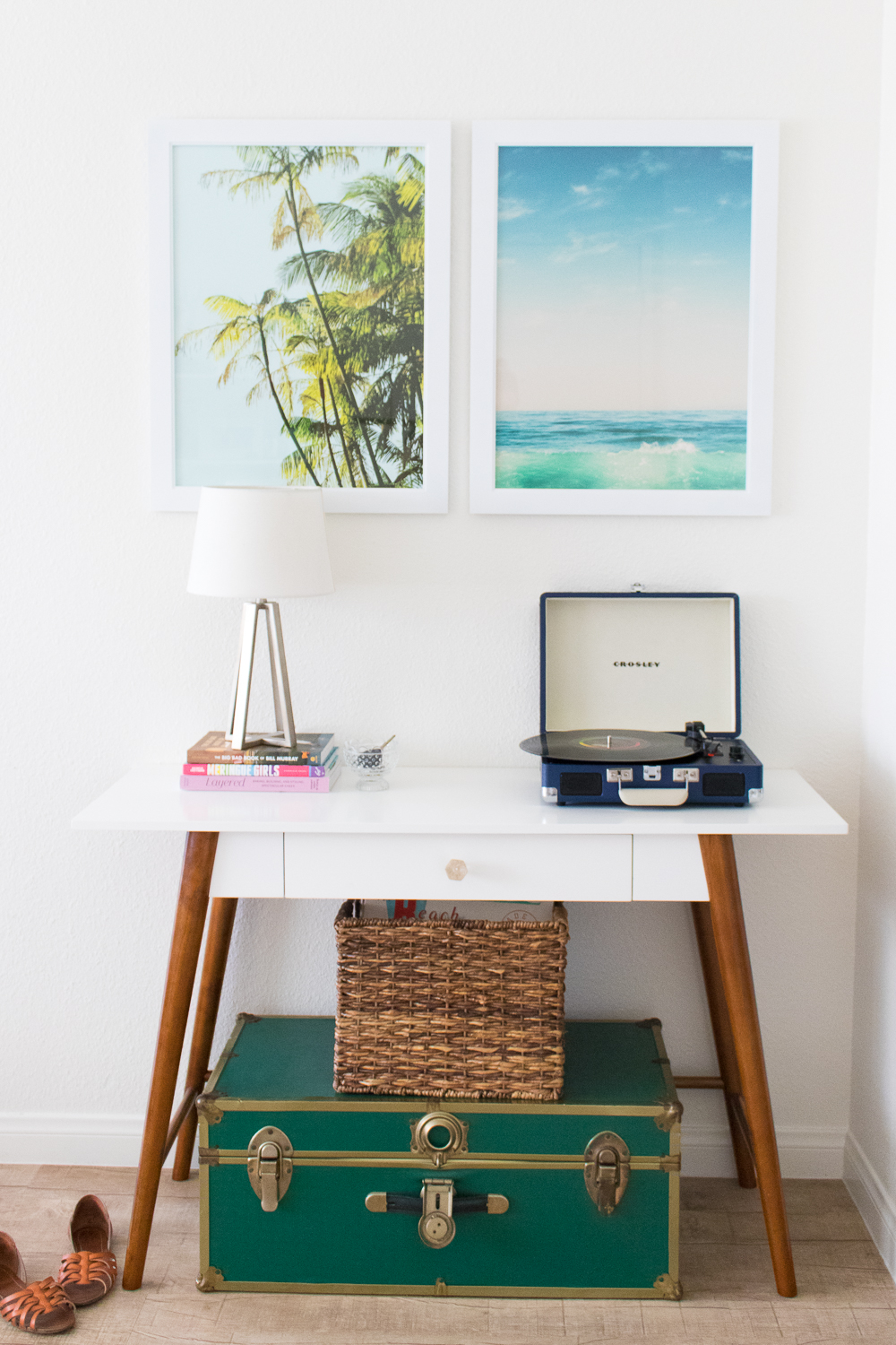
 After living together for three years, we’ve learned what the other likes and dislikes and we generally pick our battles because some things aren’t worth fussing over. Part of the reason our last apartment remained so bare was because we could not decide on artwork. Well, we’re working on it! The first area we’re tackling is our entryway table area, which is the first thing you see when you walk in the door, and we both wanted to be greeted by colorful artwork instead of a blank white wall.
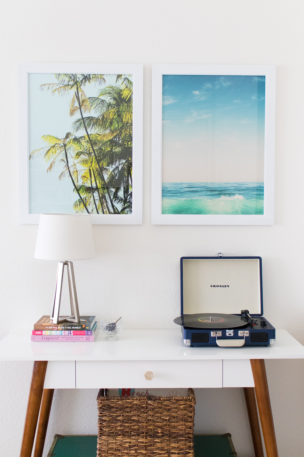
When I told Minted about my problem, they challenged us to each choose a piece of artwork from the Minted Art Marketplace and try to compromise to choose pieces that fit our individual styles but still complimented each other. While this was difficult because Minted has SO many beautiful art prints to choose from, we quickly found that our wish lists had some things in common: nature scenes and the color blue.
Can you guess which one I picked and which one Andrew picked?
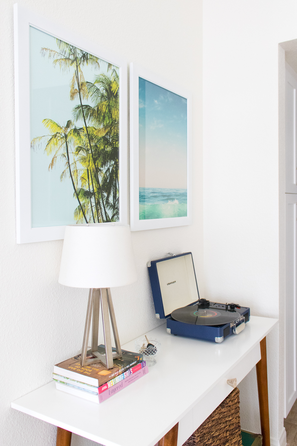
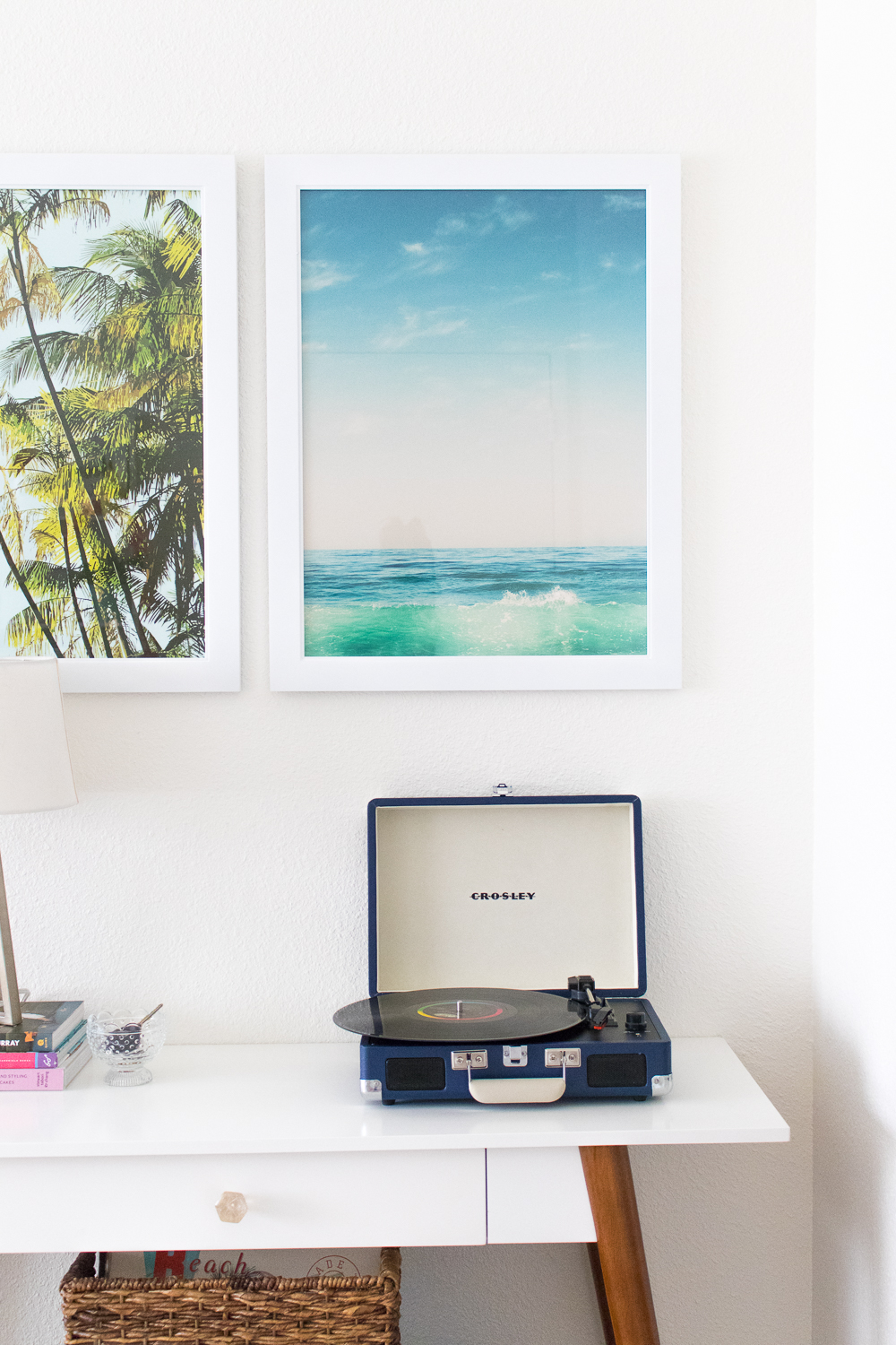 Ultimately, we looked at them all and chose these two art prints in size 18 x 24 to fill the small wall above our entryway table. He chose a classic ocean scene by Kamala Nahas to reflect the bright beachy vibe of our apartment, and I chose the palm trees with a blue background by Catherine Culvenor to compliment the beach scene, but the print also comes in other colors and I really loved the pink background as well (I just can’t seem to get him on board with pink yet).
Choosing artwork with your S.O. can be quite the struggle when you have different tastes, and it took us a bit longer than choosing something on my own, but it’s worth the extra time to choose something that feels like both of us. After all, we’re looking at these walls every day.
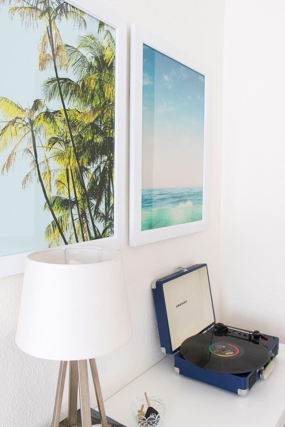 In the end, we’re still learning to compromise on home decor decisions (although I did get his OK on some bold wallpaper!) but we’re building a home that feels like like a home.
Thank you to Minted for generously providing artwork for this post. All opinions are my own. Thanks for supporting the brands that keep Club Crafted posting! Please note this post contains affiliate links from which I may collect a small profit if you make a purchase.

Brandi
This is just the cutest space! I love what you picked out.